Selecting font for your resume and cover letter – heck, your personal brand – can be an uphill battle.
I’ve lost count of how many resume variations I’ve been through, with my patience put to the test, trying to figure out — what fonts pair nicely together — represent me — AND don’t end up looking a total mess to an employer. 😩
Sound familiar?
Then keep reading.
In this blog post, I’m spilling the tea on the best fonts to use for your resume – that’ll have you creating your document faster and better – without the emotional trauma.
COMMON RESUME FONT ISSUES
Having a font or two fonts that represent you is important. It’s part of your unique brand.
Because sadly, we can accidentally end up looking like everyone else.
Actually, I’ve had hiring managers tell me before that applicant’s all “look the same”.
“It’s as if everyone stumbles across the SAME resume template and uses that ONE” – said one hiring manager.
And it’s that desire for a font to reflect our personality and professional standing that can get us into hot water.
While resumes have some guidelines there are a few hard and fast rules we do need to follow.
The font you use is one of them.
So, what exactly is the problem?
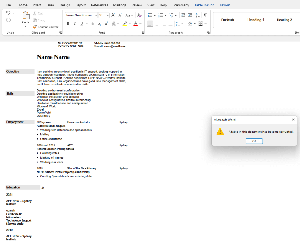
Have you ever been shocked when a recruiter says “ummmmm you’re resume is all messed up“?
You thought you sent a formatted resume.

But when they opened your document, they saw this:
MICROSOFT WORD VS OTHER SOFTWARE
Ok, it’s at this point I have to tell you yet again why MS Word is what you need to create your resume.
Trust me, it’s not because I love Microsoft.

It’s simply because Microsoft Word is the most widely used word processing software – globally.
.DOC and .DOCX documents are the staple for basically EVERY BUSINESS. Plus, Applicant tracking software also favour .DOC and .DOCX documents.
I can hear you saying “what’s .DOC and .DOCX got to do with font? I mean, Google Docs can be downloaded as a .DOCX. What give’s Lisa?”
Fair point.
Well, it’s to do with the font’s that are installed – by default – into Microsoft Word.
Arial, Times New Roman, Garamond, Verdana, Tahoma, Franklin Gothic, and Georgia show up consistently in all MS Word update releases.
But, and there is a BUT here. Microsoft has added ‘cloud fonts’. Pull down the font menu and you’ll see what I mean.

Software like Google Docs also uses cloud fonts, but they are different and not freely available in MS Word until you install them.
Montserrat, for example, is a really popular font on Google Docs. But it’s not installed on MS Word or available on MS Word as a cloud font.
Let’s say you create a resume with a custom font or a Cloud font but the recruiter you send it to doesn’t have access to this font.
What happens to your resume content?
Microsoft Word will attempt to substitute your font with another font that the recruiter does have installed.
Sometimes this can work out ok and the text is fine.
More often and not the following will happen:
- Strange font characters (imagine you resume coming out in all Windings)
- Page length is interrupted
- Alignment of text is off
- And other random stuff – I’ve even see text come out backwards
MEH, I CAN JUST EMBEDD THE FONT
Sure. Although this too can be unpredictable.
Plus, the file size of your resume skyrockets – which creates other problems.
RESUME FONTS FOR MICROSOFT WORD
I don’t know if you know this, but I started using Microsoft Word back in 1996.
*shudders*
Suffice to say, I’ve gone through A LOT of MS Word updates over the years to help me create better resumes.
The result? I’ve tried almost all MS Word fonts and combo’s.
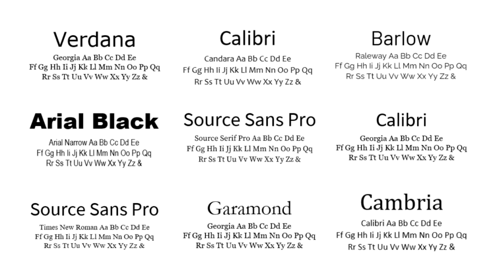
Below, you’ll find the list of MS Word single font selections and combinations that have stood the test of time and still allow me to create amazing resumes.
Sans Serif Fonts:
- Arial (Regular, Black or Narrow)
- Barlow
- Calibri
- Century Gothic
- Corbel
- Candara
- Franklin Gothic Book
- Lucida Sans
- Tahoma
- Trebuchet
- Verdana
- Source Sans Pro
- Raleway
Serif Fonts:
- Times New Roman
- Baskerville Old Face
- Book Antiqua
- Cambria
- Century Schoolbook
- Garamond
- Georgia
- Palatino
- Perpetua
- Source Serif Pro
WHICH RESUME FONTS PLACE NICELY TOGETHER?
RESUME FONT TIPS & TRICKS
Okay, you have the best fonts for your resume in your palm – now what?
If you want to take your resume to the next level, some basic editing tips and tricks will take your content from 😒 to 🤩.
Font size is an easy way to help separate your text make your content standout.
…the only problem.
It can feel like an advanced science lesson. 🥴
To decide on font size, you need to experiment a little based on the amount of content you have.
First up, decide on which font or combo you want.
Decide on initial size for headings and body content.
Then add to your content.
See how it looks, feels and if your content sits nicely on the page – not dangling awkwardly onto a third page or so small you need a magnifying glass to read it.
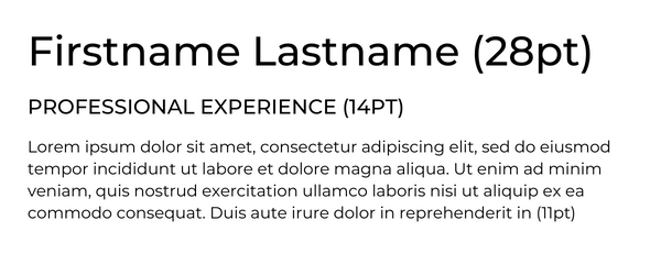
A good starting point is 11pt for body font, 14pt for sub headings, 28pt for your Firstname Lastname at the top of the resume.
Like this:
RESUME FONT GOLDEN RULE - BE CONSISTENT
I’ve mentioned consistency few times in other blog posts, but what does it actually mean, and why is it so important?
Being consistent with font and font size across your document creates harmony and makes it easy for a recruiter to skim read.
Remember, our brains LOVE patterns, and when you create one font and font size, it instantly makes your resume more engaging.
Hot Tip🔥: This means each sub-heading is the same font and size. All body text is the same font and size etc.
LEVEL UP YOUR RESUME STRATEGY WITH A GREAT RESUME TEMPLATE
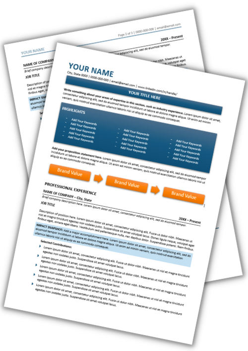
My 2-page professionally designed Microsoft Word resume template will help you get visible in your market…so you go from being invisible to “OMG, I love your resume!”
Boost your engagement…so you never get a “crickets only” response to your job search again.
Did I mention it's Free?
✔️ ATS Friendly
✔️ Microsoft Word
✔️ Correct font and sections included